Rehla
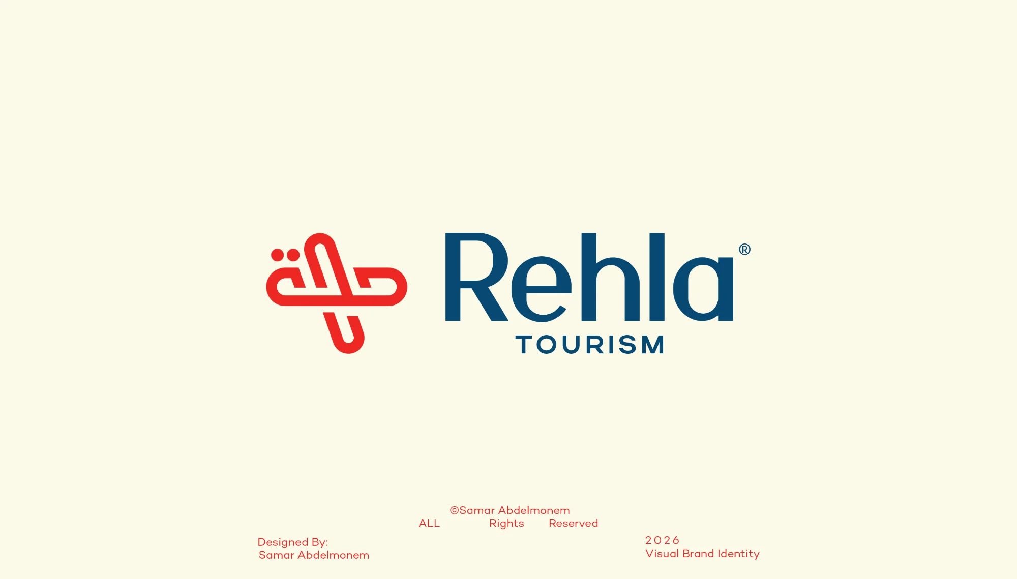
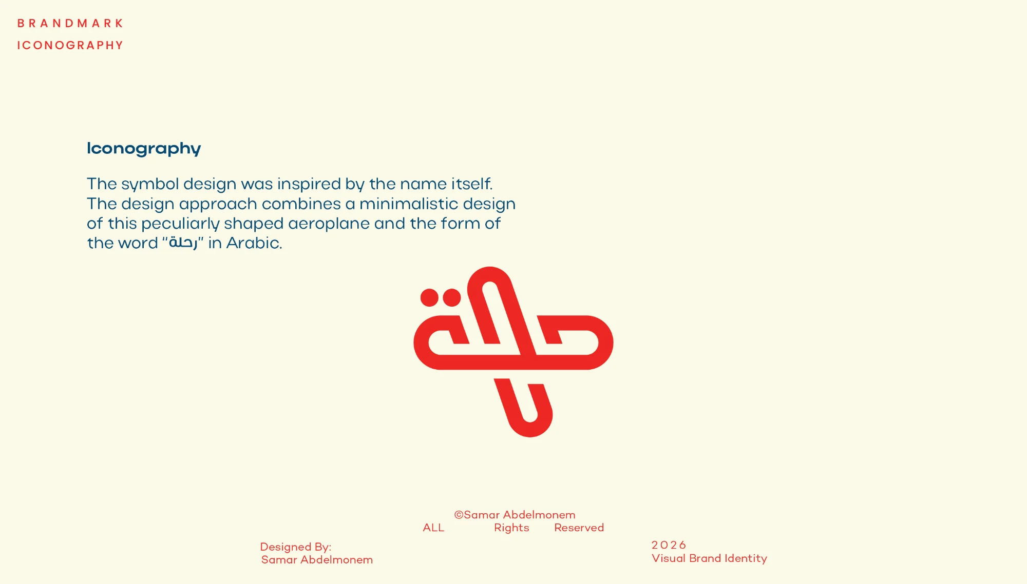
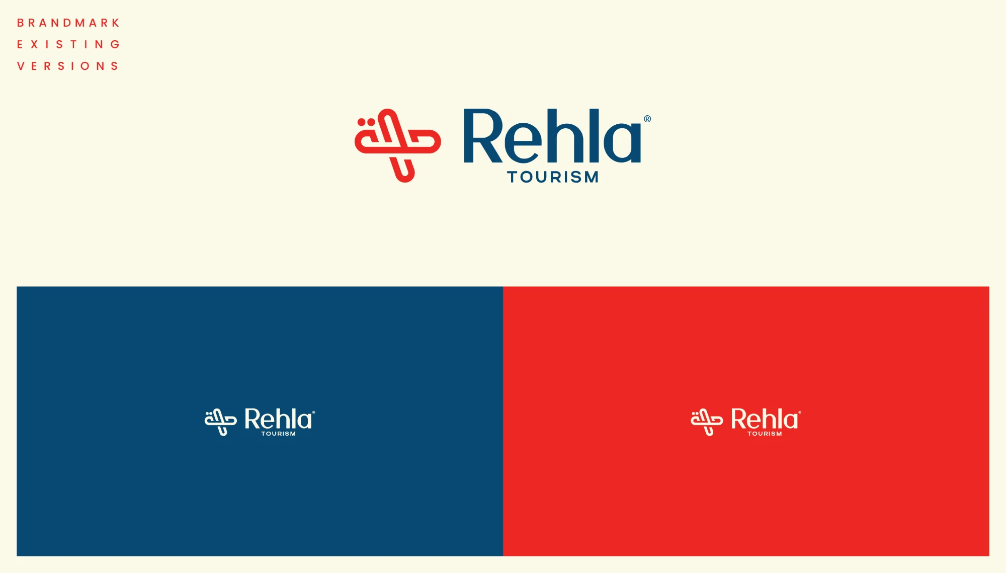
An aeroplane drawn from the Arabic word رحلة, journey.
Rehla is a travel and tourism brand. The symbol comes from the name itself: the letters of رحلة are folded into a minimal, unusually shaped aeroplane, so the word and the journey become one mark. Margita gives the wordmark a warm, welcoming voice, Actay Wide opens up headlines like a wide horizon, and Actay Regular keeps every detail clear. A soft cream, a bold red and a deep cerulean blue carry the brand from the logo to campaigns and merchandise.
- Scope
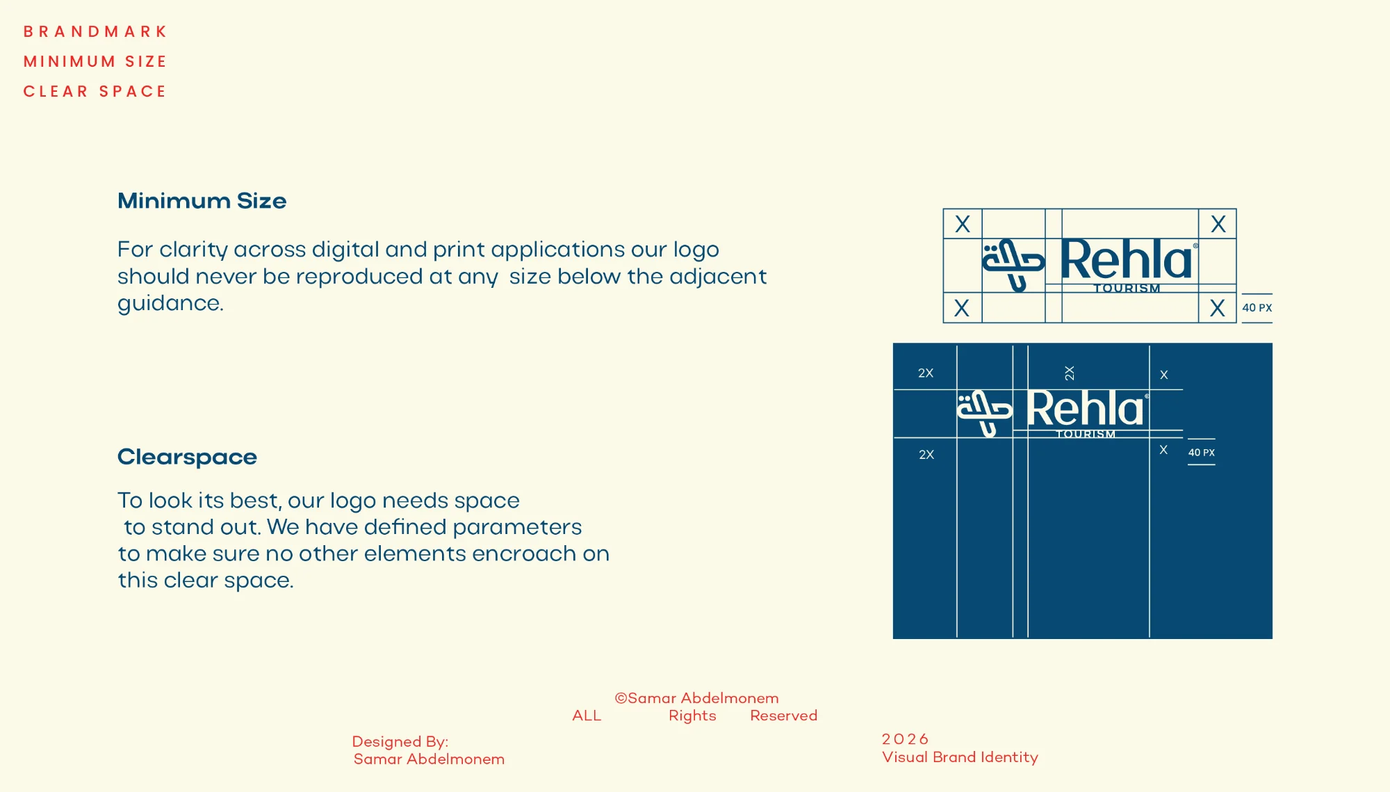
- Wordmark and symbol, colour palette, typography, logo guidelines, campaign visuals, merchandise
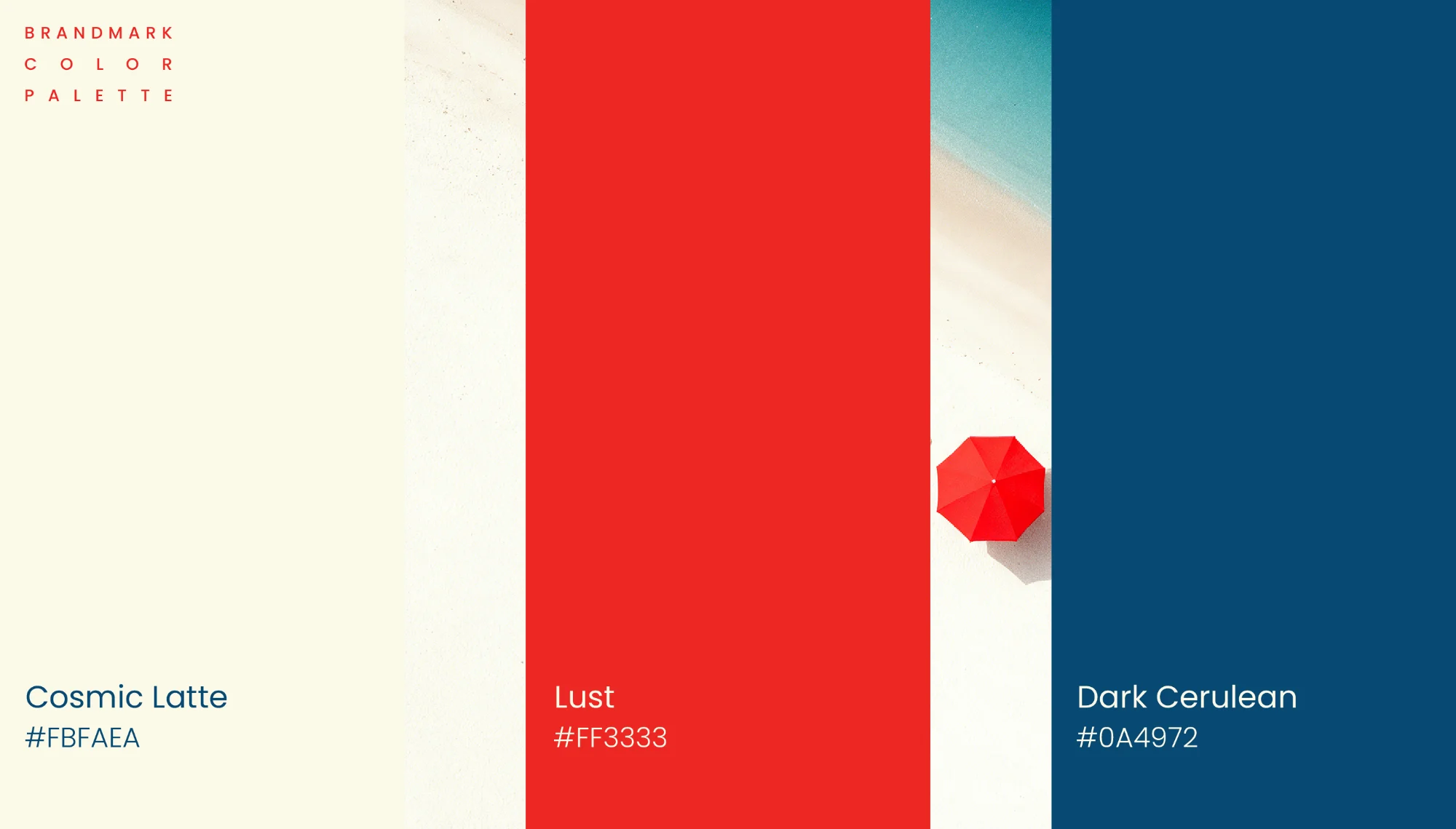
- Palette
- Cosmic Latte #FBFAEA · Lust #FF3333 · Dark Cerulean #0A4972
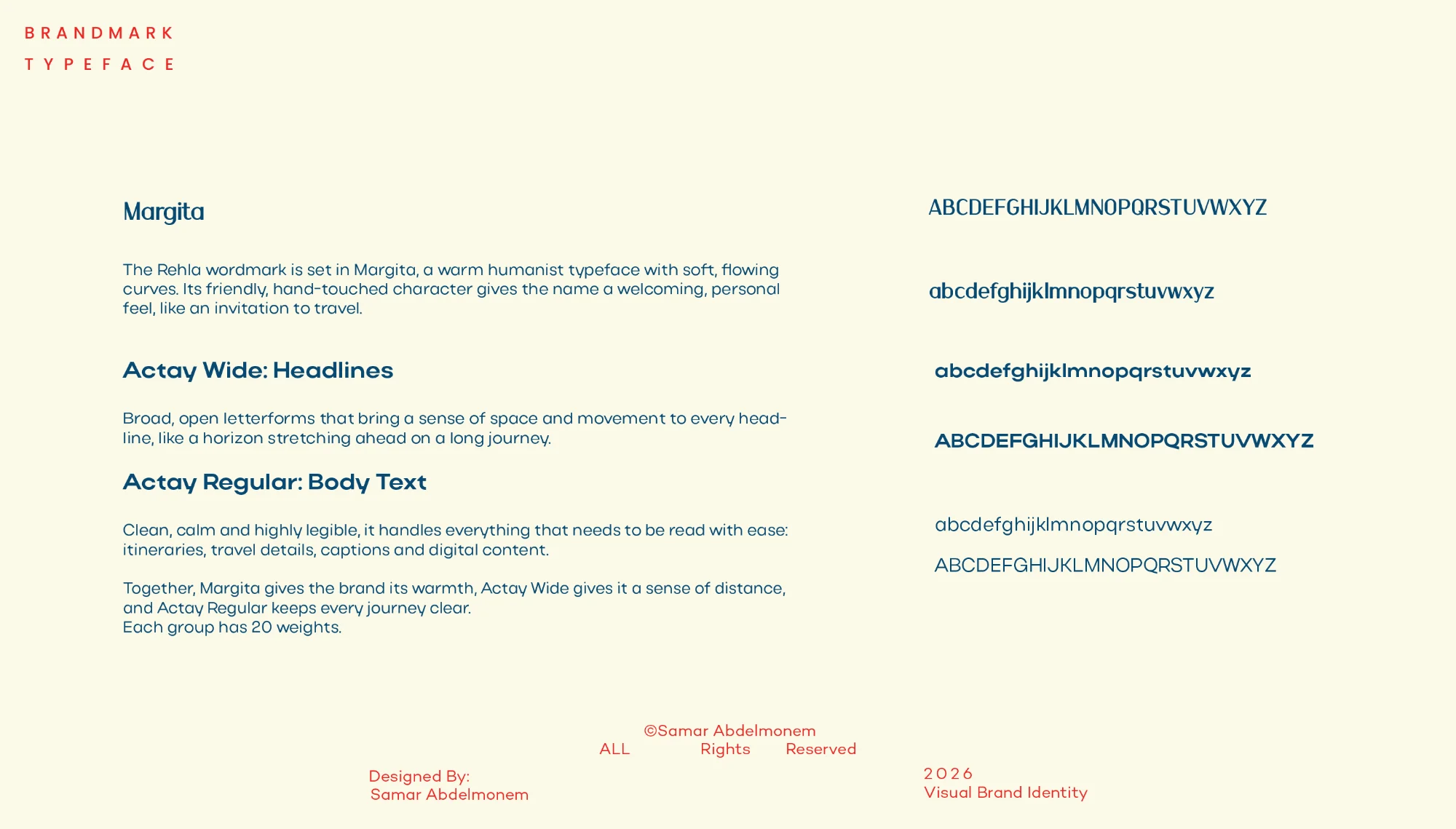
- Type
- Margita (logotype) · Actay Wide · Actay Regular

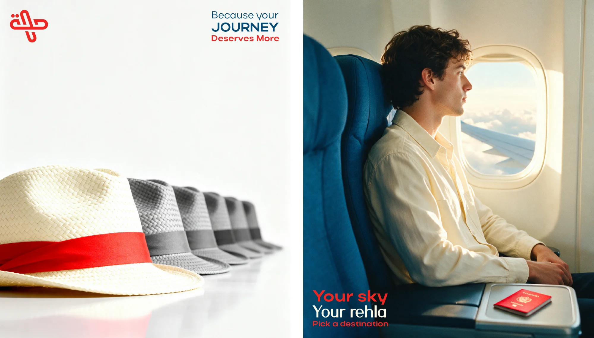
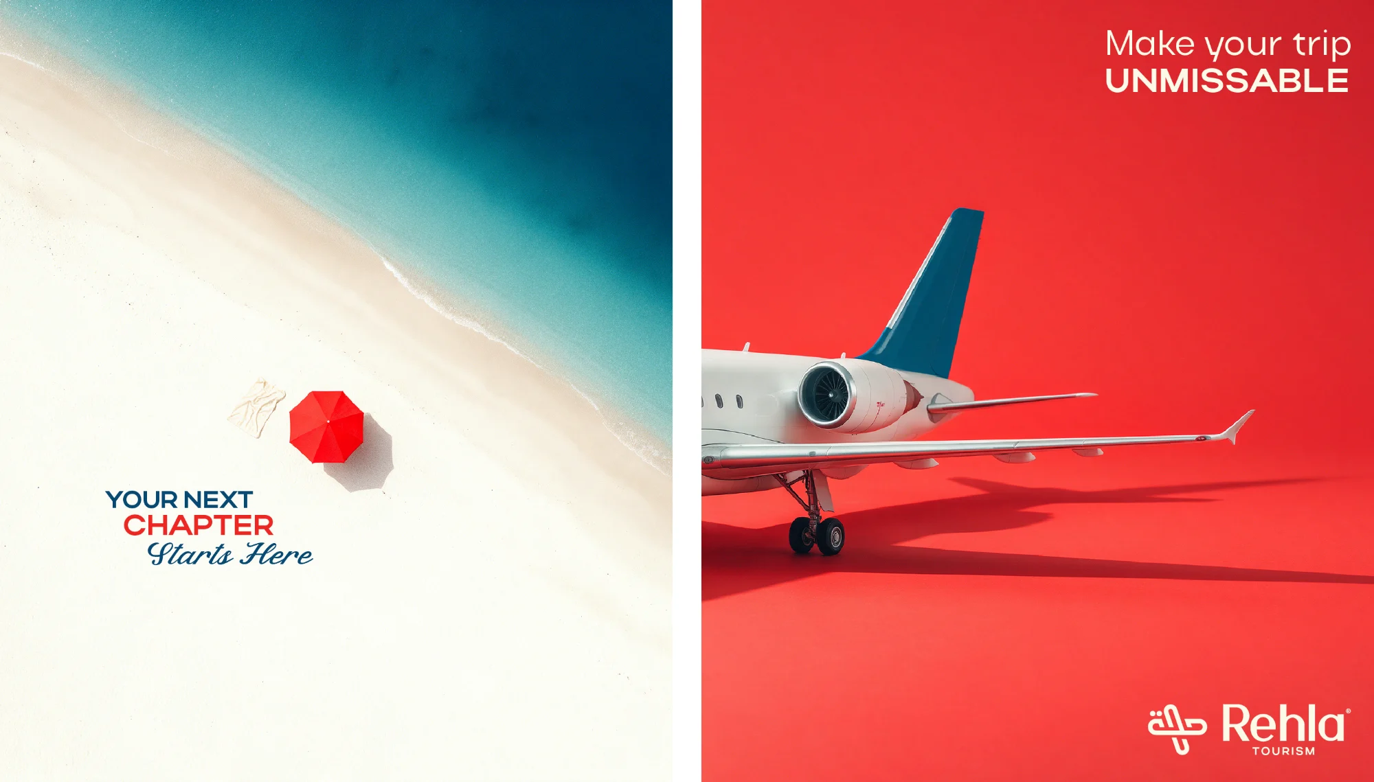
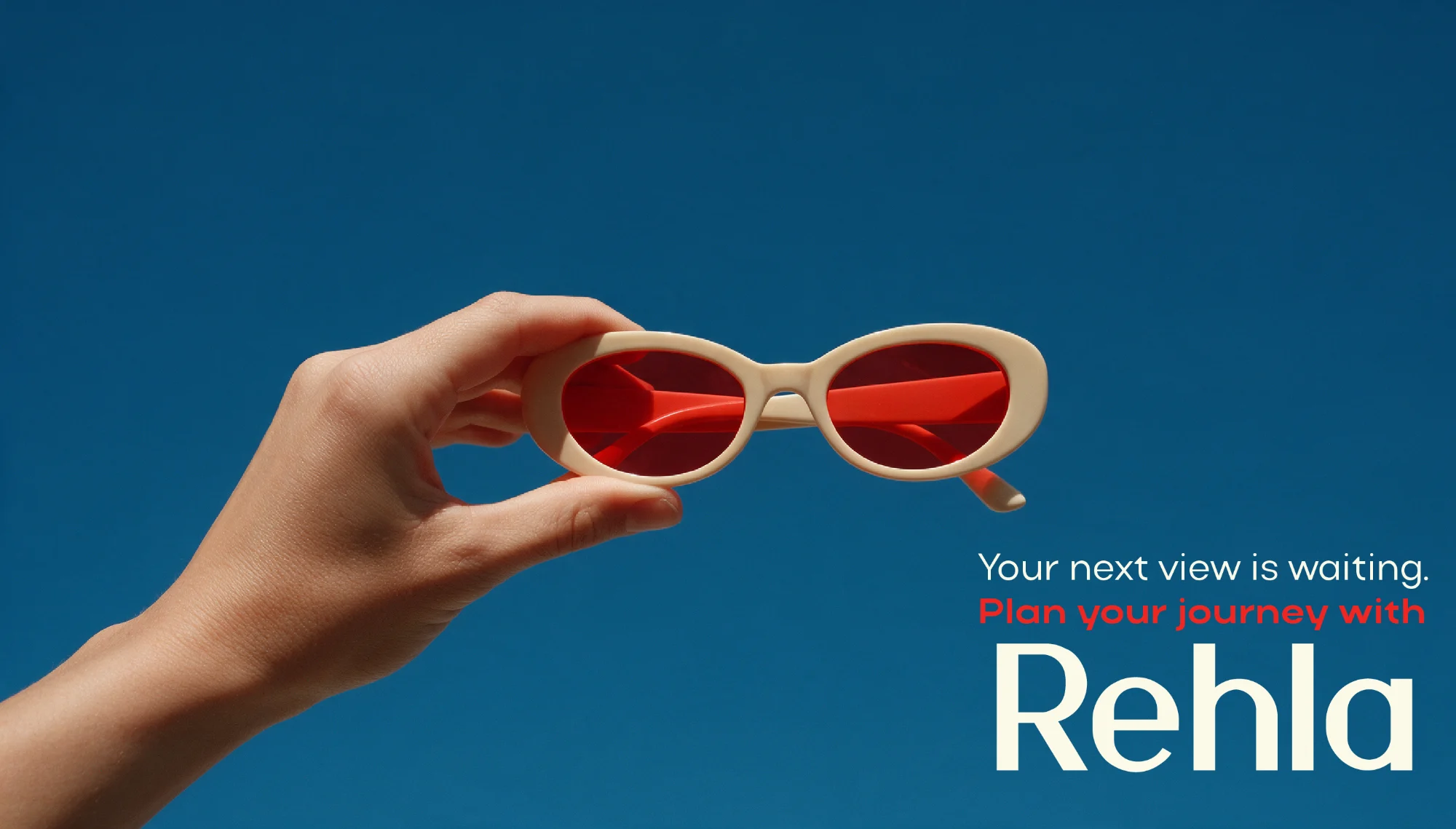
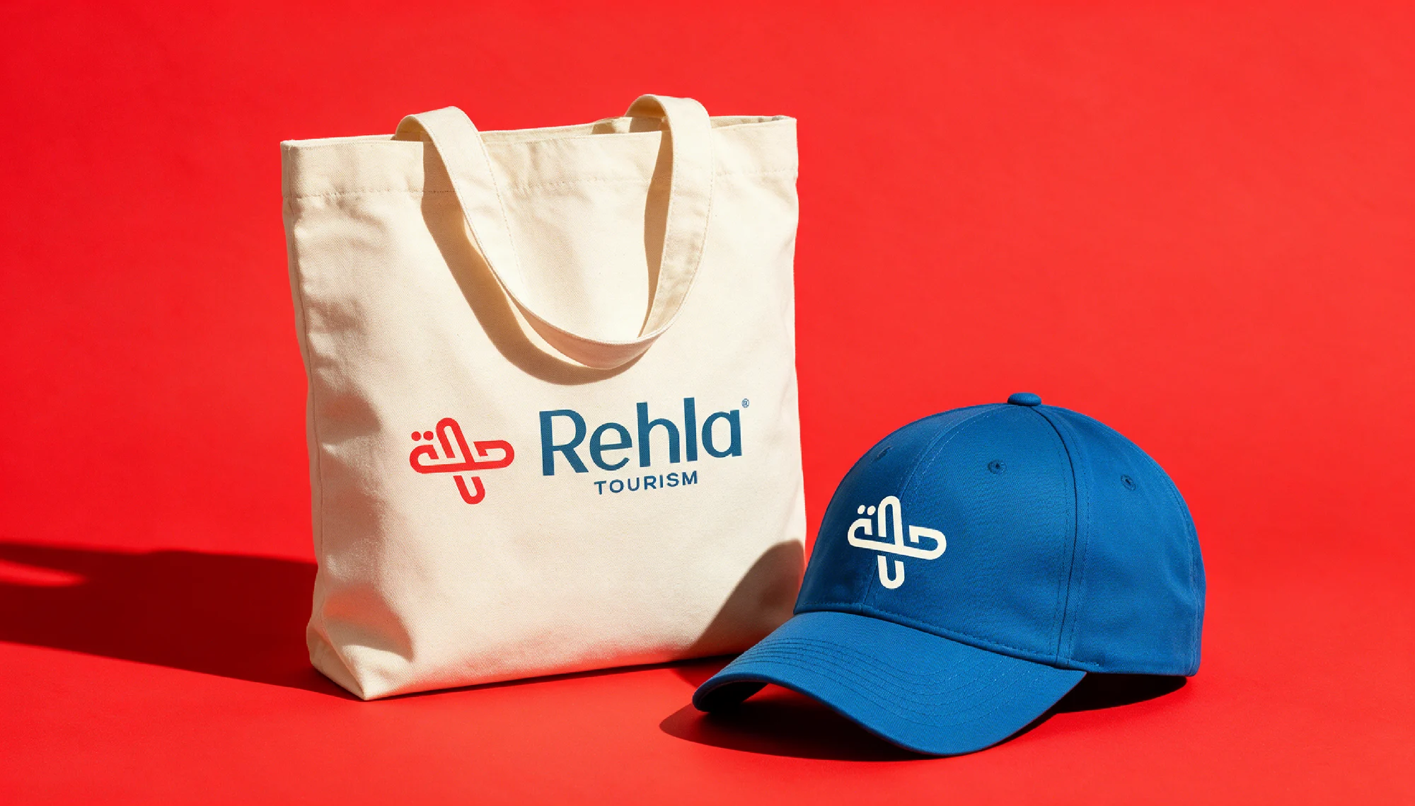
Applications shown on mockups and visualised scenesRead it on World Brand Design Society ↗