Balance
A spark, held in balance.
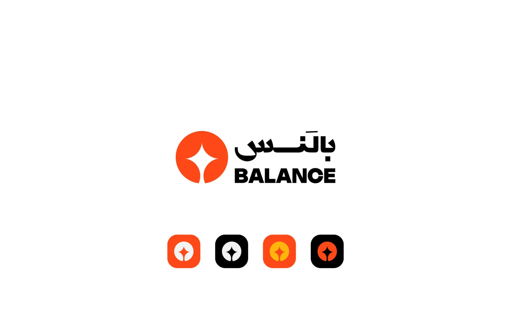
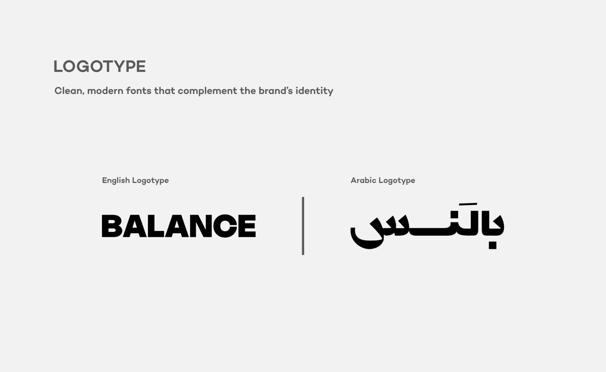
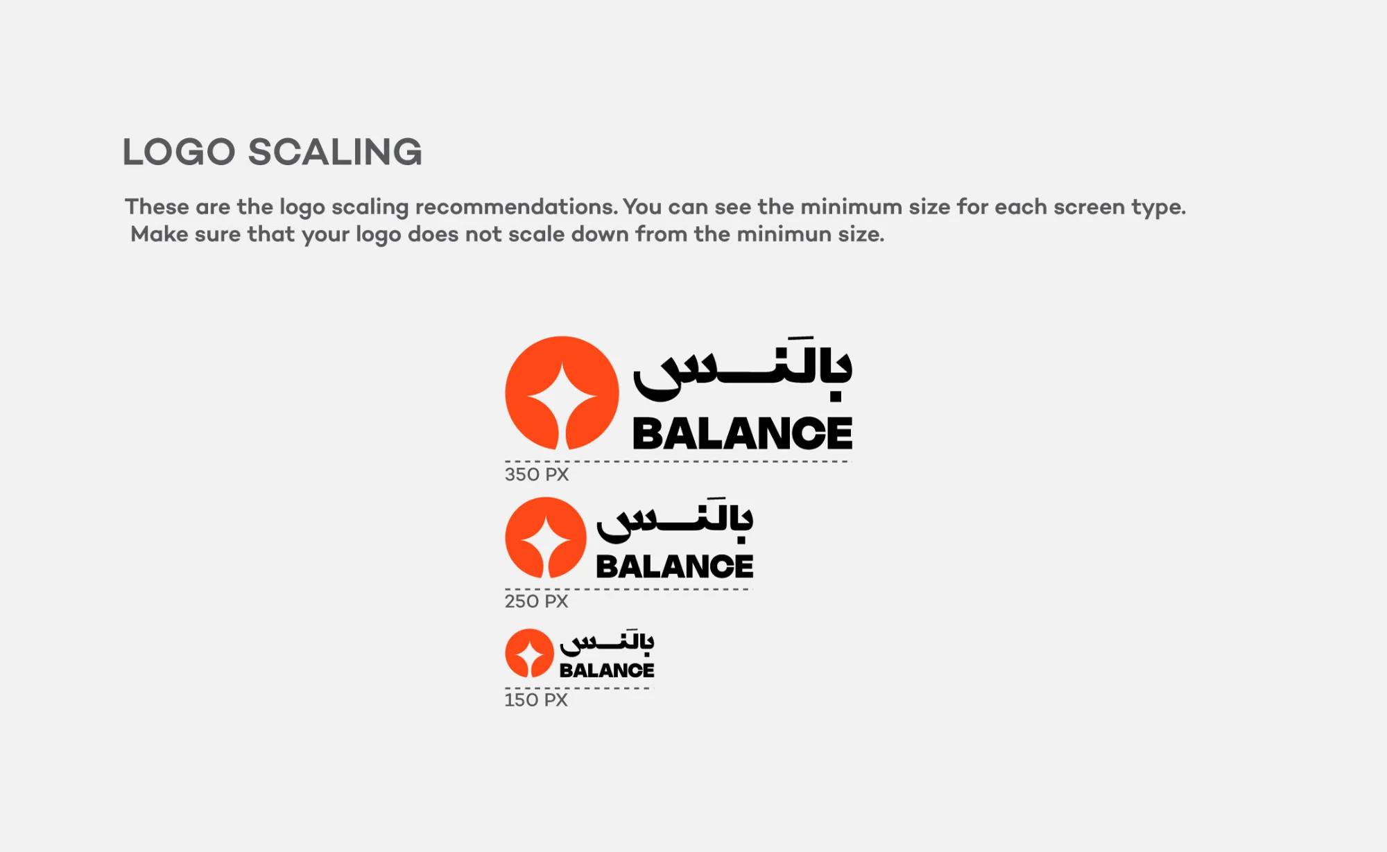
Balance, بالَنس, is a marketing communications and creative content agency. The mark is a four-point spark set inside a circle: the idea and the discipline that holds it steady. A bilingual wordmark pairs bold English capitals with a flowing Arabic logotype, and a reddish orange, backed by yellow, near-black and porcelain, carries the brand across the app icon, the website, stationery, packaging tape, merchandise and an exhibition stand.
- Scope
- Bilingual logotype and symbol, app icon, colour palette, logo guidelines, stationery, website and app visuals, merchandise, exhibition stand
- Palette
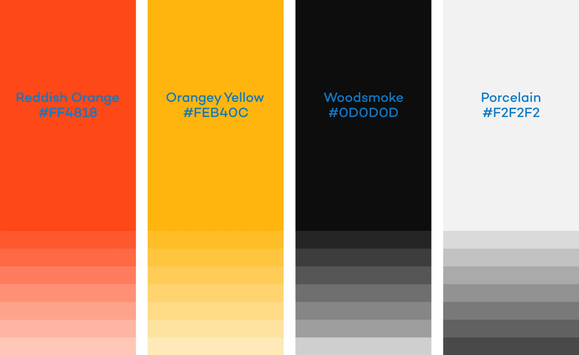
- Reddish Orange #FF4818 · Orangey Yellow #FEB40C · Woodsmoke #0D0D0D · Porcelain #F2F2F2
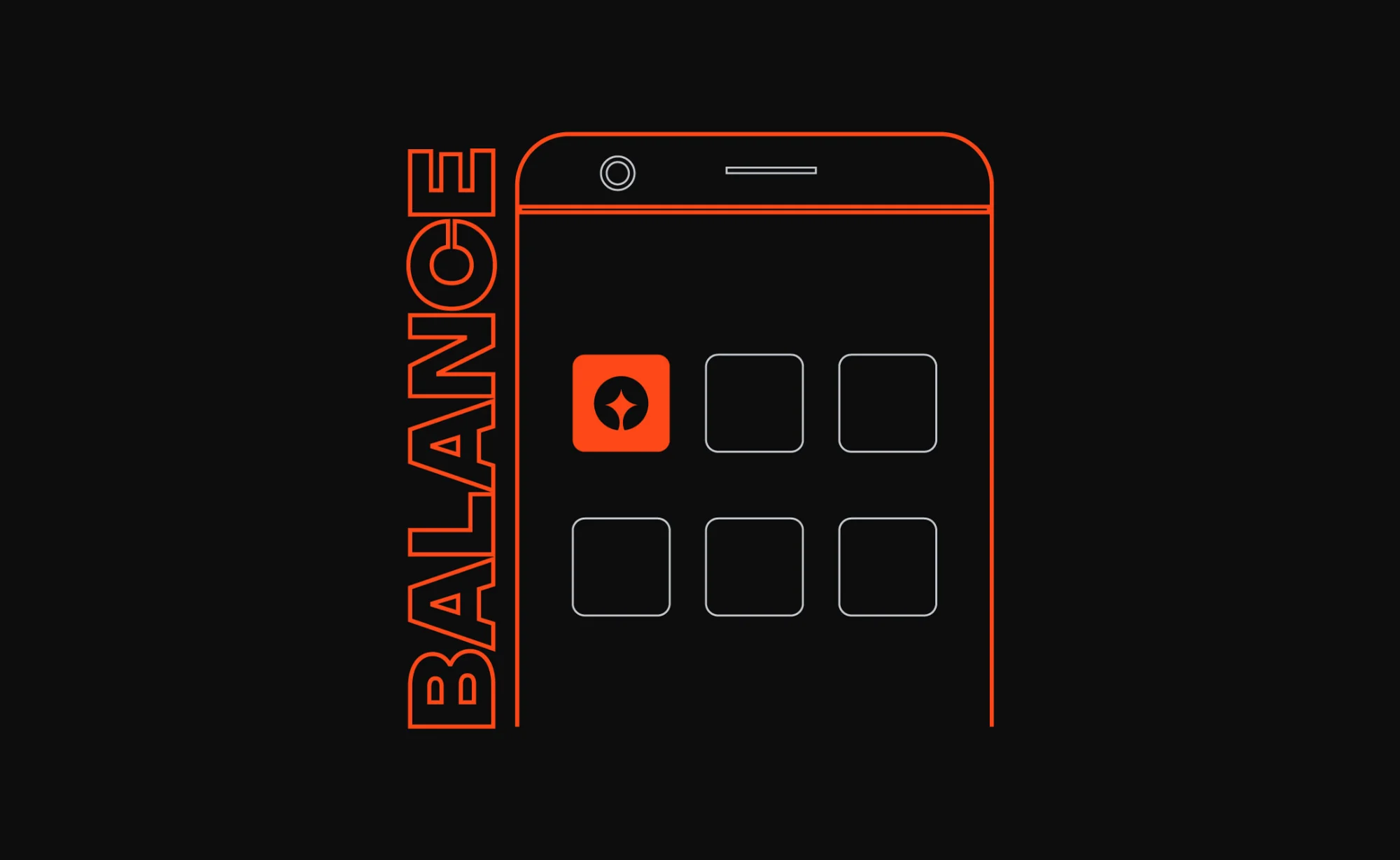
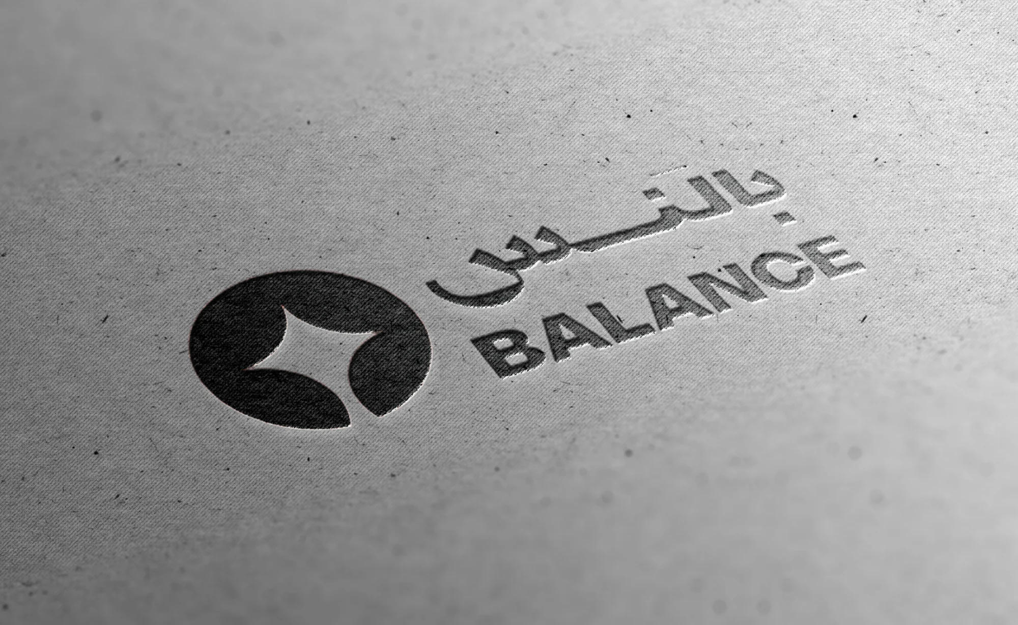

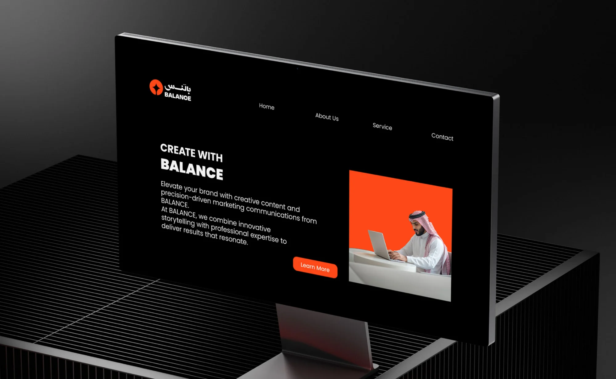
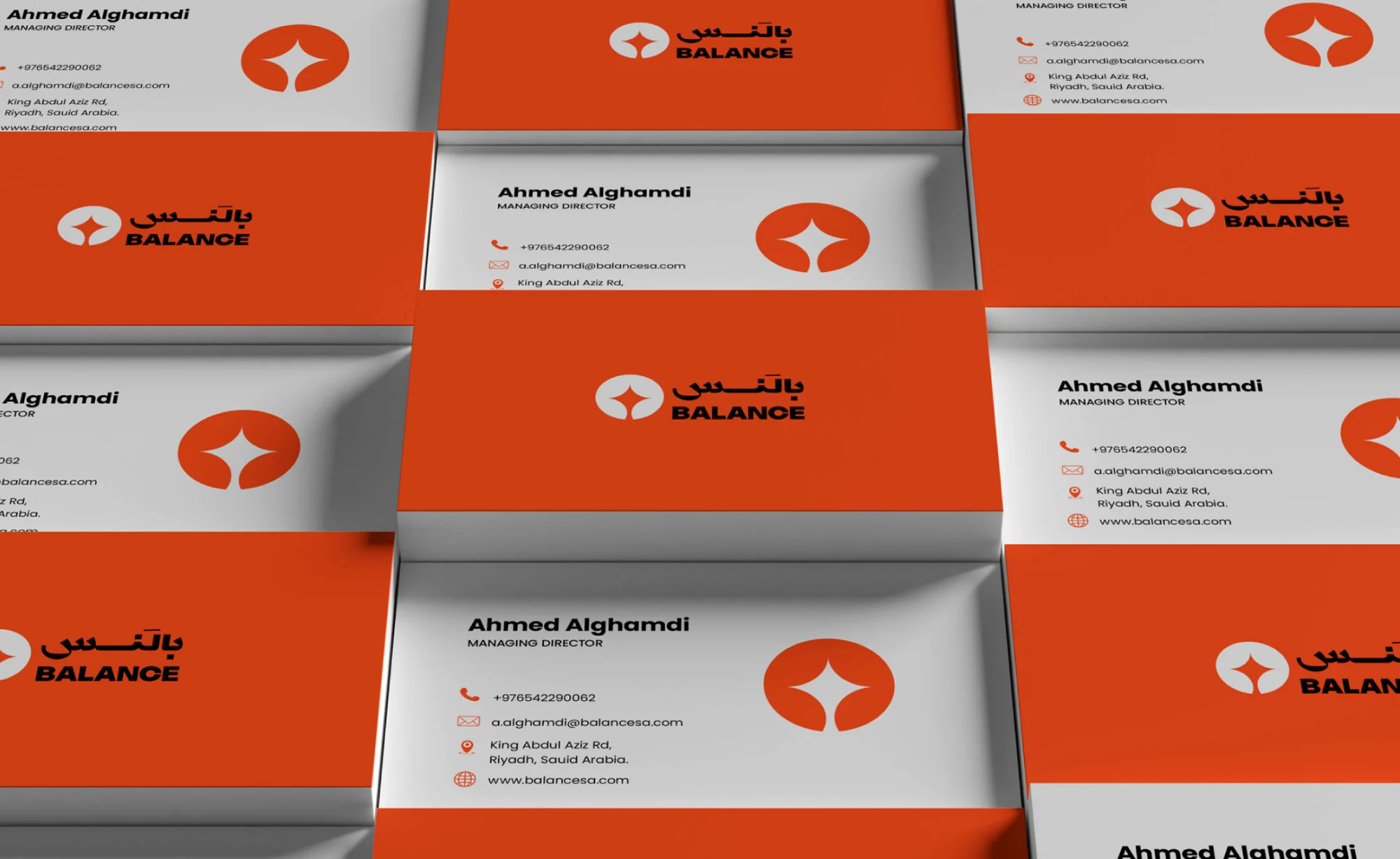
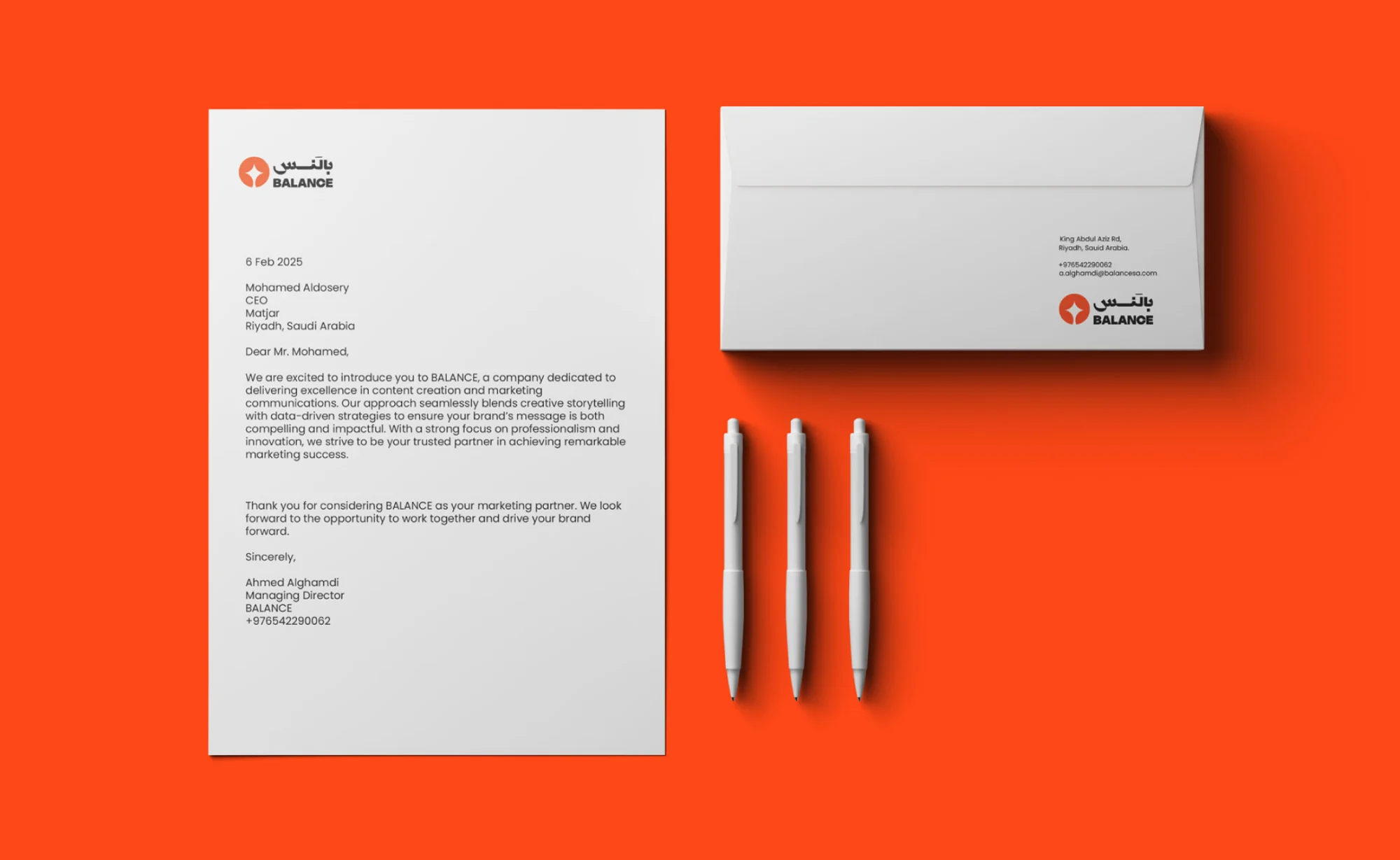
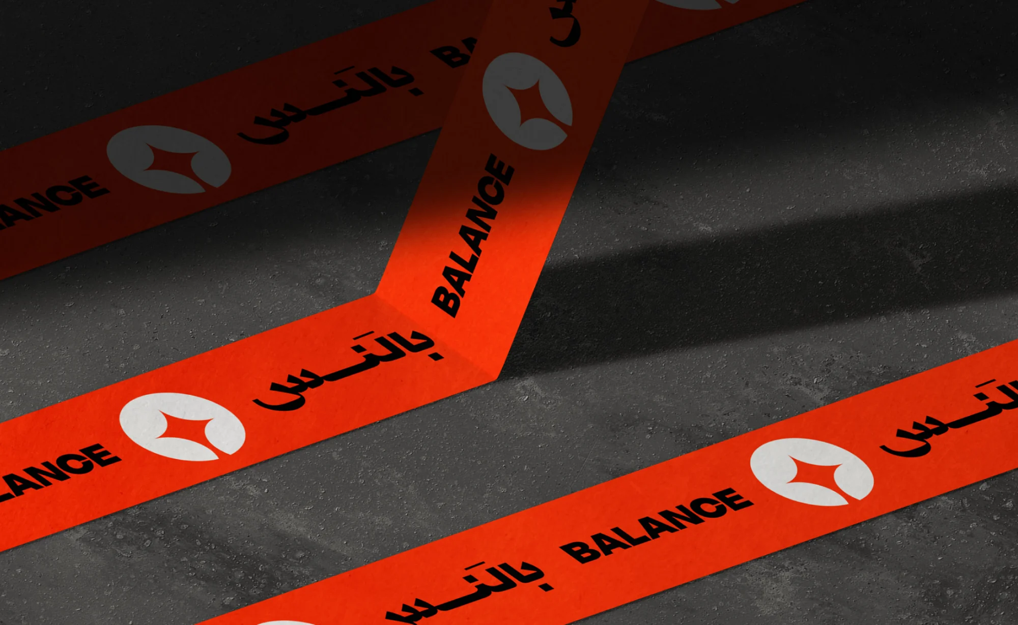
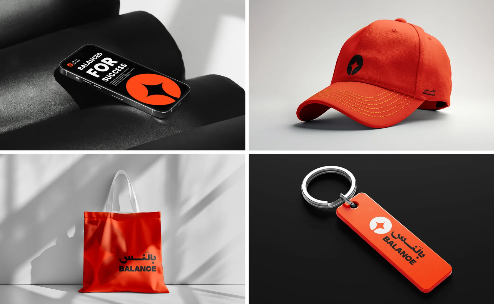
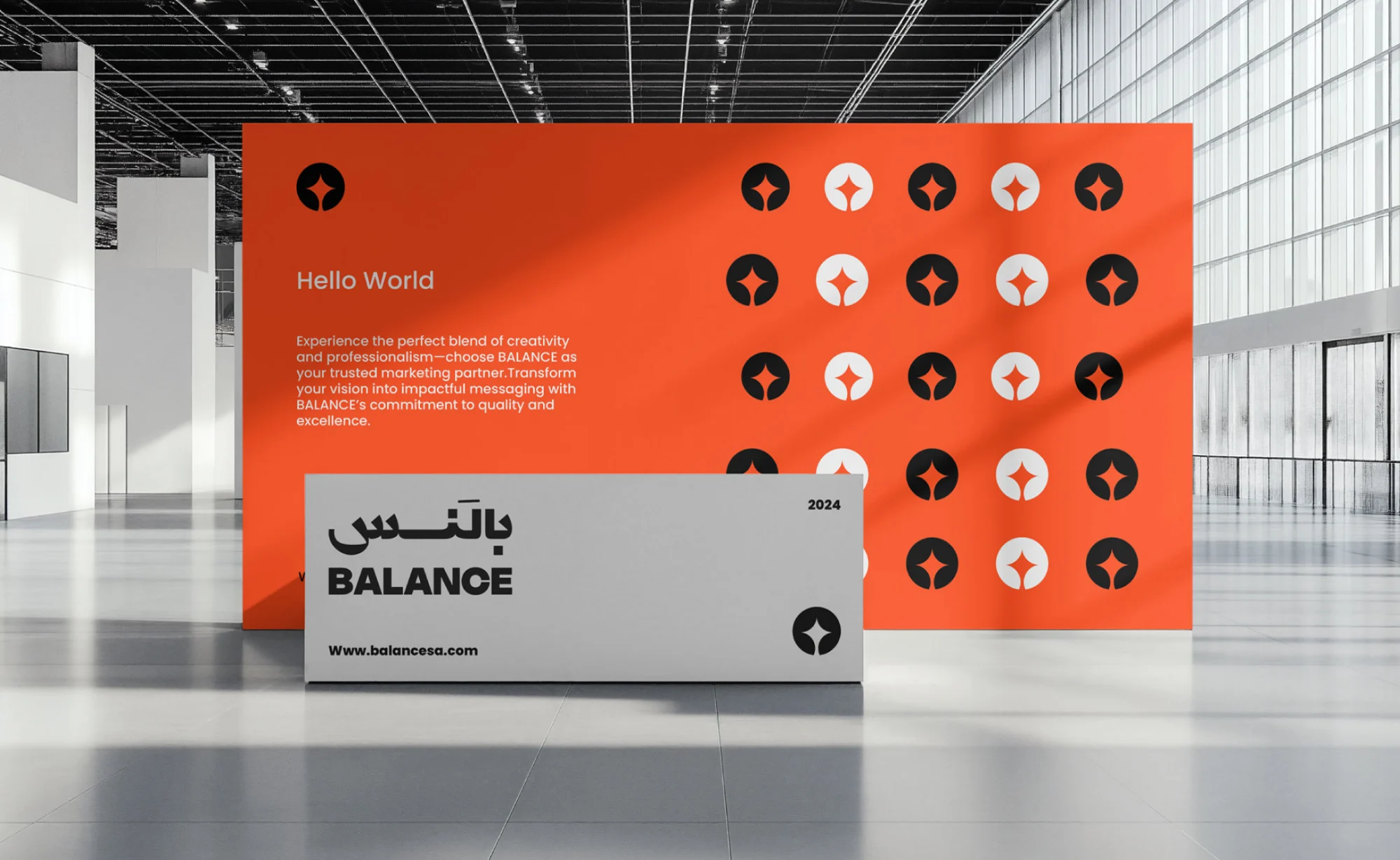
Applications shown on mockups and visualised scenes