5 colour palettes from nature for your brand identity
Samar Abdelmonem · · 5 min readChoosing brand colours from a blank page is hard. Nature is full of colour combinations that look right at first glance. Here are five palettes I built from five animals, with their colour codes and the kind of brand each one suits.
Why take colours from nature?
Nobody designed these combinations. They are part of Allah's creation, and they were in harmony long before colour theory gave the reasons names. A palette taken from an animal arrives already balanced: one dominant colour, quieter supporting colours and a small, strong accent.
That balance is what a brand needs: one colour people remember you by, colours that support it, and one that draws the eye when you need it.
How to read each palette
Each palette below has four colours, and each colour has a job:
- Main colour. The one people remember you by. It takes the most space.
- Secondary colour. Supports the main colour in backgrounds, patterns and illustrations.
- Background or text colour. A light or dark colour for calm areas and for writing.
- Accent. A strong colour used in small amounts: for a button, a price or an offer.
The codes are HEX values, the format used on screens. Copy them into Canva, Illustrator, Figma or any design tool.
The pictures are illustrations I generated with AI, inspired by real animals, and the colours were measured from each picture.
Green gecko: fresh and lively
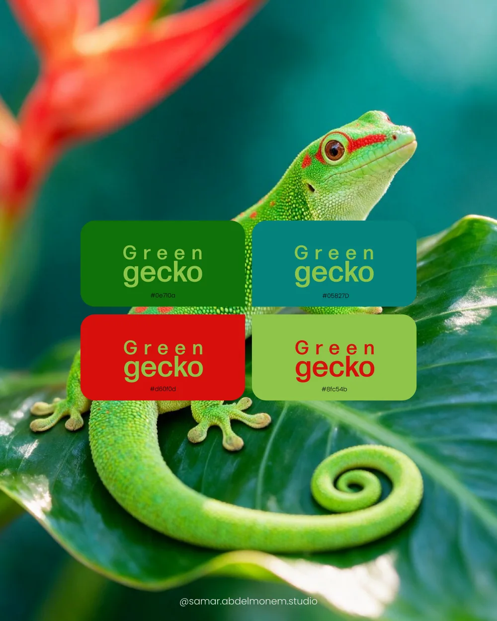
Two greens and a deep teal, lifted by one bright red. It feels natural and full of energy, like something just picked.
Suits: juice bars, healthy food, plant shops, organic and natural products, and brands for children.
How to use it: let the greens do the work and keep the red for small details such as a price tag or an offer sticker. Red and green in equal amounts fight each other.
Turquoise and red fish: summer and sea
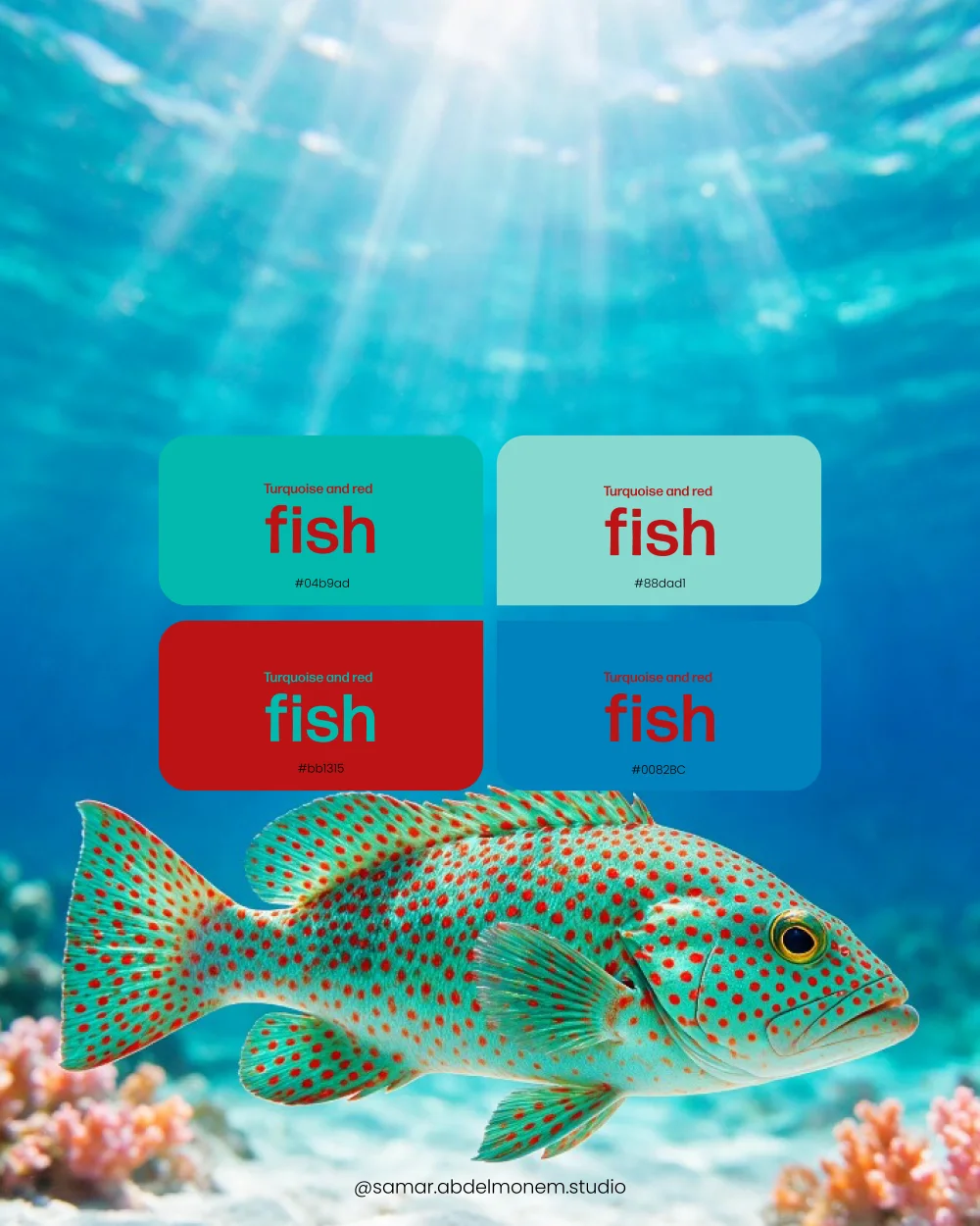
Turquoise, a pale aqua and an ocean blue, with a deep red that wakes them up. Clean, cool and playful.
Suits: travel and tourism, swimwear, seafood restaurants, pools and water parks, ice cream, and products for children.
How to use it: use the pale aqua for backgrounds and the turquoise for the logo. Put red text on the pale aqua, not on the blue, where it becomes hard to read.
Striped snail: bold and warm
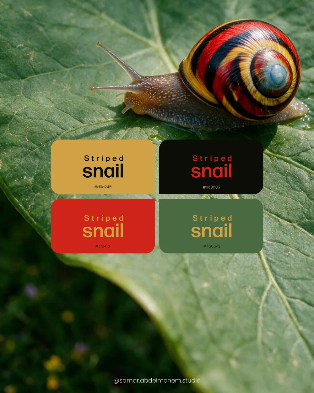
Mustard gold, leaf green, a strong red and black. It has the confidence of an old shop sign.
Suits: restaurants and burger places, spices and sauces, coffee carts, handmade products, and brands with a heritage feel.
How to use it: mustard as a background with black text is one of the most readable pairs there is. Bring the red in for names and headlines, and the green for small supporting details.
Python skin: warm and luxurious
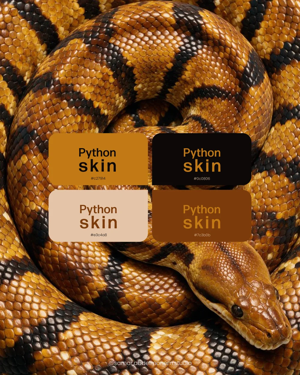
Amber, deep brown, sand and black: one family of colour from light to dark. It reads as rich and calm.
Suits: coffee roasters, chocolate, dates, oud and perfume, leather goods, and bakeries.
How to use it: because the colours are close relatives, this palette is hard to get wrong. Sand for backgrounds, black for text, amber for the details you want noticed. In print, the amber can become gold foil.
King penguin: calm and professional
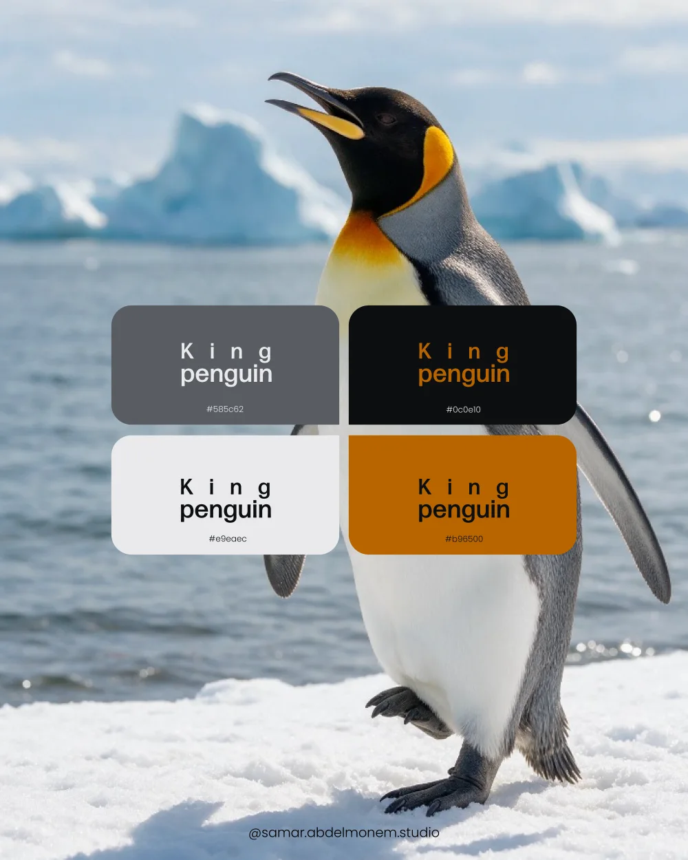
Slate grey, off-white and black, with a single warm orange. Serious without being cold.
Suits: contracting, logistics, engineering, technology, consulting and medical companies.
How to use it: build nine tenths of the design from the three neutral colours, and spend the orange only where you want the eye to go: a button, an icon, one key number.
How to choose the right palette
- Start from your customer, not your favourite colour. Ask what the people you sell to expect from a brand in your field, then decide whether to meet that expectation or stand apart from it.
- Look at your competitors. If every café near you is brown and green, a different main colour makes you easier to remember.
- Check where the colours will appear. A colour that glows on a phone can look dull on a carton or a shop sign. Ask for a printed proof before you approve.
- Test the text. Write your name and one line of small text on every colour. If you have to squint, change the pairing.
How to use a palette
A common rule is 60, 30, 10: about 60% of what people see is the main colour or the neutral background, 30% the secondary colour and 10% the accent. Using every colour in equal amounts is the fastest way to make a brand look noisy.
- Record the exact values in your brand guidelines: HEX and RGB for screens, CMYK for print.
- Make sure the logo still works in one colour, in black and in white.
- Use the same colours everywhere, from the Instagram post to the invoice.
A palette is one part of a brand identity. If you are not sure what the rest includes, read Logo vs brand identity: what is the difference?
Questions people ask
- How many colours should a brand have?
- Three to five is enough for most brands: one main colour, one or two supporting colours, a neutral for backgrounds and text, and one accent. More than that is hard to keep consistent.
- Can I use these palettes for my own brand?
- Yes. The codes are free to copy. Treat them as a starting point: a palette still has to be adjusted to your logo, your field and the way your products are printed.
- What is the difference between HEX, RGB and CMYK?
- HEX and RGB describe colour on screens. CMYK describes ink on paper. The same colour needs a value in each system, and a good brand guide lists them side by side.
- Which colours suit a restaurant or a café?
- Warm colours such as red, mustard and brown are common in food brands because they feel warm and appetising, which is why the striped snail and python palettes work well for food. The best choice still depends on your concept: a healthy-food brand may be better served by the greens of the gecko palette.
Want a palette built around your own brand? Tell me about your project and I will suggest the right colours and package.